A rebrand for an employee rewards & e-commerce platform
Cobalt Brand

I co-designed the rebrand effort for Caroo, a company that specializes in employee recognition solutions. While going through a revision of the product and goals as a company, we realized we needed to establish a new brand to capture the evolving direction.
Overview
Team credits: Joe W. - Product Designer
Role
Branding & identity Graphic design
Web design
Design system
Tasks
Logo creation
Marketing site redesign
Email template design
Branding guidelines
Design system
Marketing materials
Competitor analysis
Tools
Figma
Adobe Illustrator
Trello
Notion
Company
Caroo
The challenge
The existing company brand, referred to internally as “Mulberry,” was representative of the company’s previous business objective of solely being an employee (physical) gifting platform.

Previous recipient snack box selection
During the pandemic and about a year after, Caroo’s service of delivering snack boxes and gifts to employees was flourishing as many people were working remotely. Employers were desperately looking for ways to show their employees they cared, while navigating this new remote-work environment.
However, after some time passed and many workers were encouraged, sometimes required, to return to the office and/or budgets set aside to support employee gifting and engagement lessened, so did the need for employee physical gifting.

Previous email template

Previous recipient message
The company needed to evolve and pivot to support its user’s needs. The new product vision expanded beyond physical gifting into digital recognition and engaging your employees in other ways. The goal was to become a SaaS product and tool which uses behavioral science-backed recognition personality assessments to get to the heart of how people/employees want to be recognized, and give managers the tools to provide those meaningful moments to them.
The platform in turn, required an overhaul of the design of existing features, responsive web designs for the new “employee intelligence” features and supporting marketing-related digital and print artifacts. To complement the new vision, a brand refresh was needed to further elevate the company in the eyes of their consumers.
Color palette
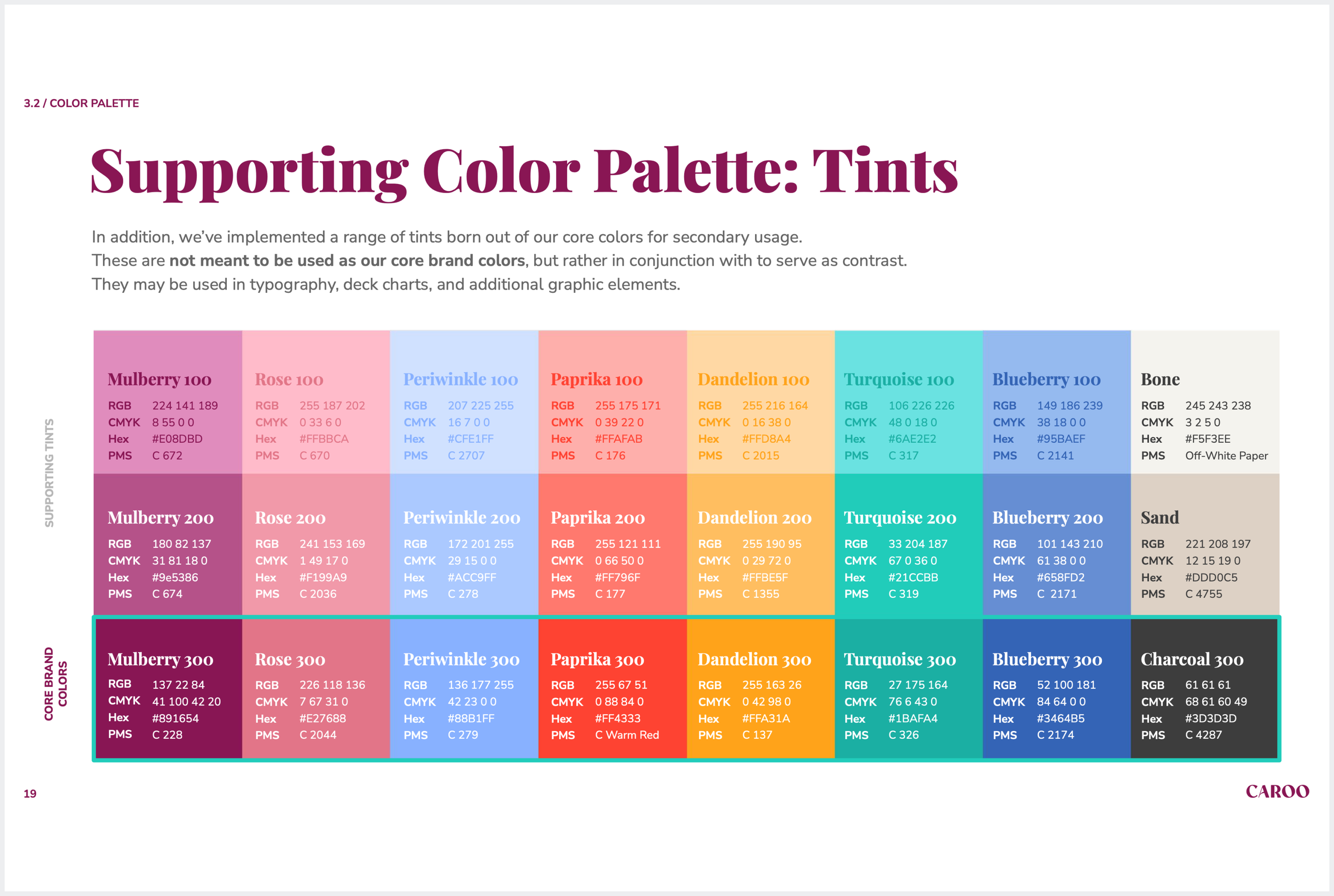
As our previous color palette consisted of Mulberry as the core brand color, we internally referred to this brand as “Mulberry.” For this new color palette, we aimed for a refreshed, modernized look with more trendy, bold and impactful colors.
We coined the term, “Cobalt” as the codename for the new brand. The accent color is a bright bluish/purple, similar to the chemical element, which is resilient, much like the company’s ability to overcome difficult obstacles and pivot when necessary.


Before (“Mulberry”)

After (“Cobalt”)
Fonts
The hero font is Gilroy and it is used across the Cobalt platform and marketing promotional material. It was chosen for its bold, approachable and well-rounded letterforms and personality. Gilroy is applied to headings. The secondary font is Open Sans and is applied to body copy. It was selected for its ease of legibility and its clean, minimalistic design.
Before

After

Logo
The Caroo logo is based off of Caroo’s commitment to create a place to help organizations understand their people more deeply, recognize, celebrate and connect with every employee effortlessly and at scale.
The logo consists of a deconstructed fingerprint and a ripple effect. The fingerprint symbolizes a person’s identity, specifically their “recognition identity”, representing the way they prefer to receive and give appreciation. The fingerprint is also a brand motif that is depicted in other areas such as the Marketing site, customer platform and promotional materials. The ripple symbolizes an act of recognition that starts with one, and spreads throughout, in a positive way.
Before

After

Exploration & design process
When beginning the logo creation process, I went through a series of exercises to help brainstorm ideas and ground me in determining a direction to take. After meeting with stakeholders to gather their thoughts and have initial conversations about the brand, I began my process with looking into some of our competitors’ logos and brand identities.


Step 1: Analyze competitor’s logos and what it should represent

Step 3: Sketch emerging ideas
Step 2: Brainstorm top logo goals and do a word association
Step 4: Iterative rounds of design (one round is depicted below)

Iconography
We chose to employ the Material Design 2.0 icon library for this rebrand as its style aligns well with our new clean, bold aesthetic. I created any icons specialty icons that Material Design did not have available.
Before
After
Style Guides
It’s essential to spend time establishing a design system or a visual design language to ensure a uniform appearance to a product, website or app experience. These guidelines also acted as a way of aligning all stakeholders on the expectation of the final design implementation.


Artifacts
Carrying out the new brand throughout all facets that represent the company, involved creating several artifacts such as: marketing landing page, product graphics, promotional graphics, brand guidelines, design system, email templates, conference flyers, business cards, blog imagery and sales deck.
Conference flyers

Business card

Email template

“RecognitionDNA” product feature

Responsive website banners

Gift card product graphics

Responsive website banners

Sales presentation deck (cover page depicted)

Marketing landing page


